New logo for Picqer
After 11 years, it’s time for a new logo and a fresh visual style for Picqer. One that tells our story. One that shows we simply build great warehouse software, while staying personally involved with our customers. Last year, we partnered with Verve to make it happen.
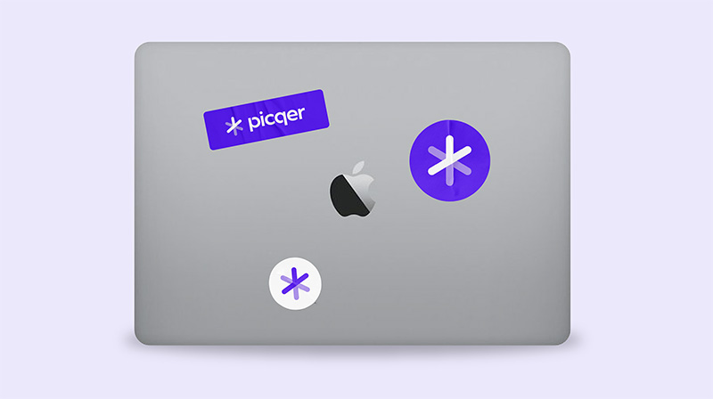
The logo
Together with Verve, we created our new logo. We’re moving from blue to purple. From cautious to confident. And from a pallet with a cloud to the Picqer Link.
![]()
The grid
Multiple links form a grid. This grid is inspired by warehouse shelving. It represents structure and leaves room for growth. That’s what we do for webshops. We bring structure to the warehouse and create space to grow.
![]()
Inspiration and the grid
The grid and different versions of the Link are key elements you’ll start seeing everywhere.
Purple
Now about the color. Our old blue logo felt too corporate. We’re deeply engaged with our customers. We want to understand them and help them as best we can. That calls for a warm, human color. That’s purple. Picqer Purple.
We’re super excited about our new look. In three weeks, you’ll see it on full display at the Webwinkel Vakdagen.